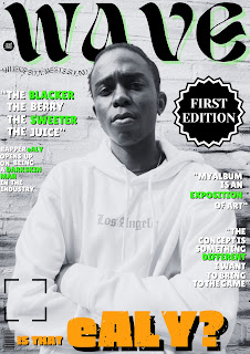
This is my fourth draft of my second cover as I have changed the image again which is of higher quality and depicts the talent in a different manner
This is the second version of my magazine cover with a photo that centres the talent more and is more focused on him. However, the image quality was not up to parr and was lacking compared to my main magazine cover.
This is the first version of my magazine cover, however the cover lines were too spaced out with no clear main cover line and the picture background was too busy.


No comments:
Post a Comment